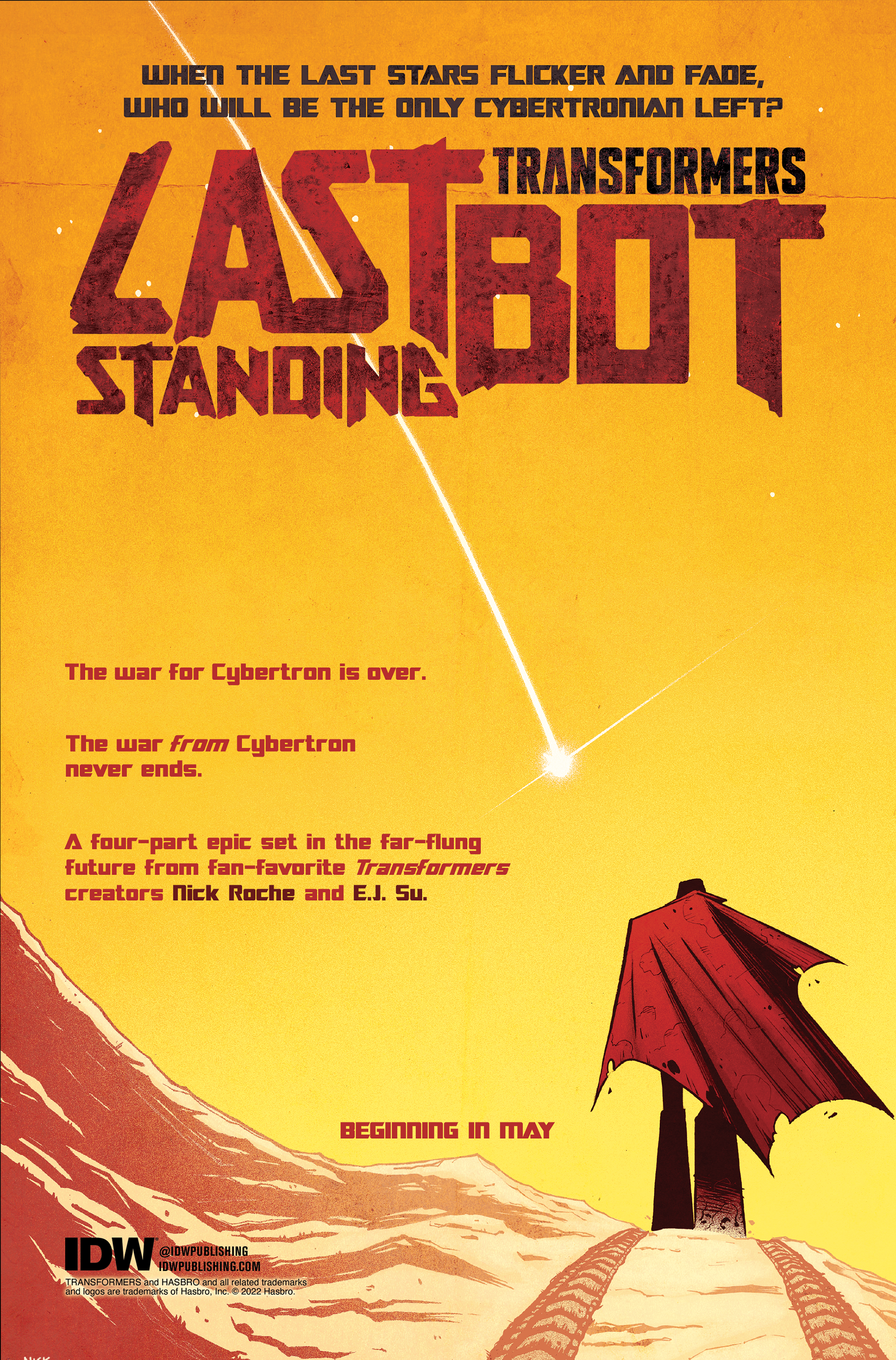
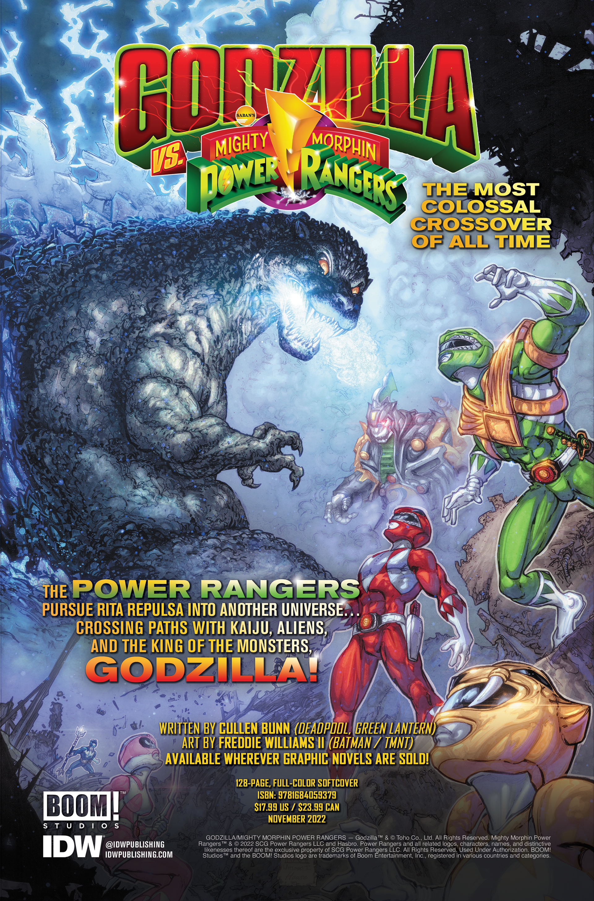
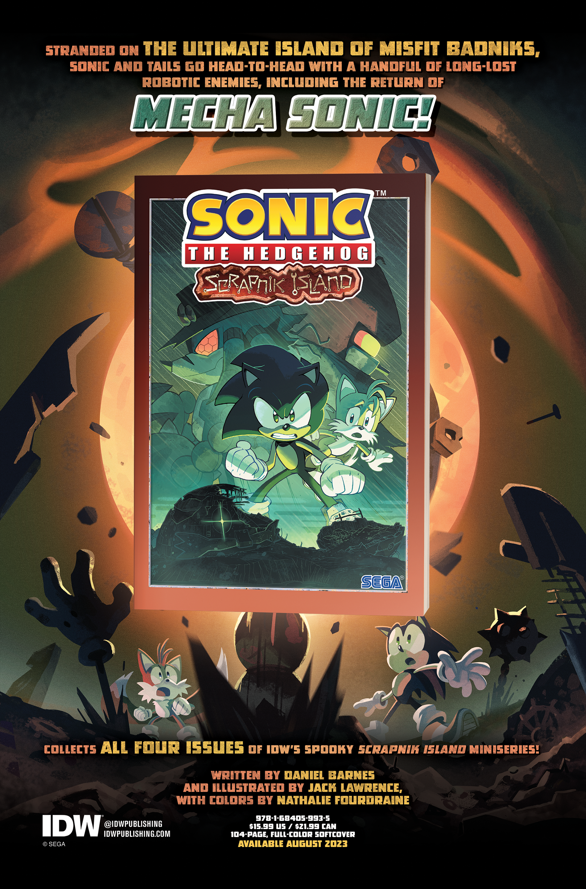
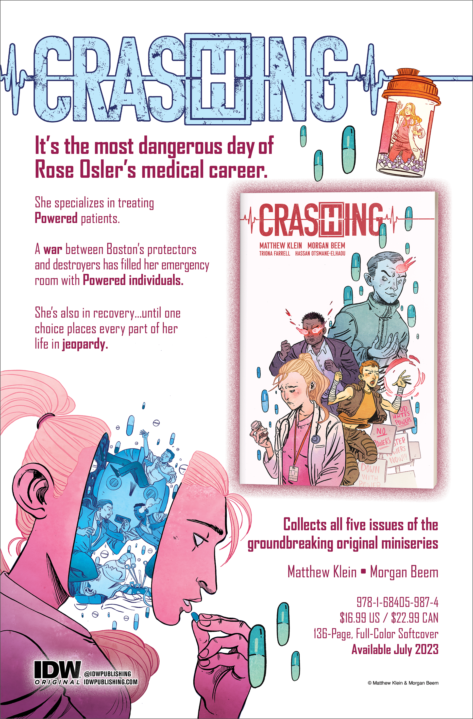
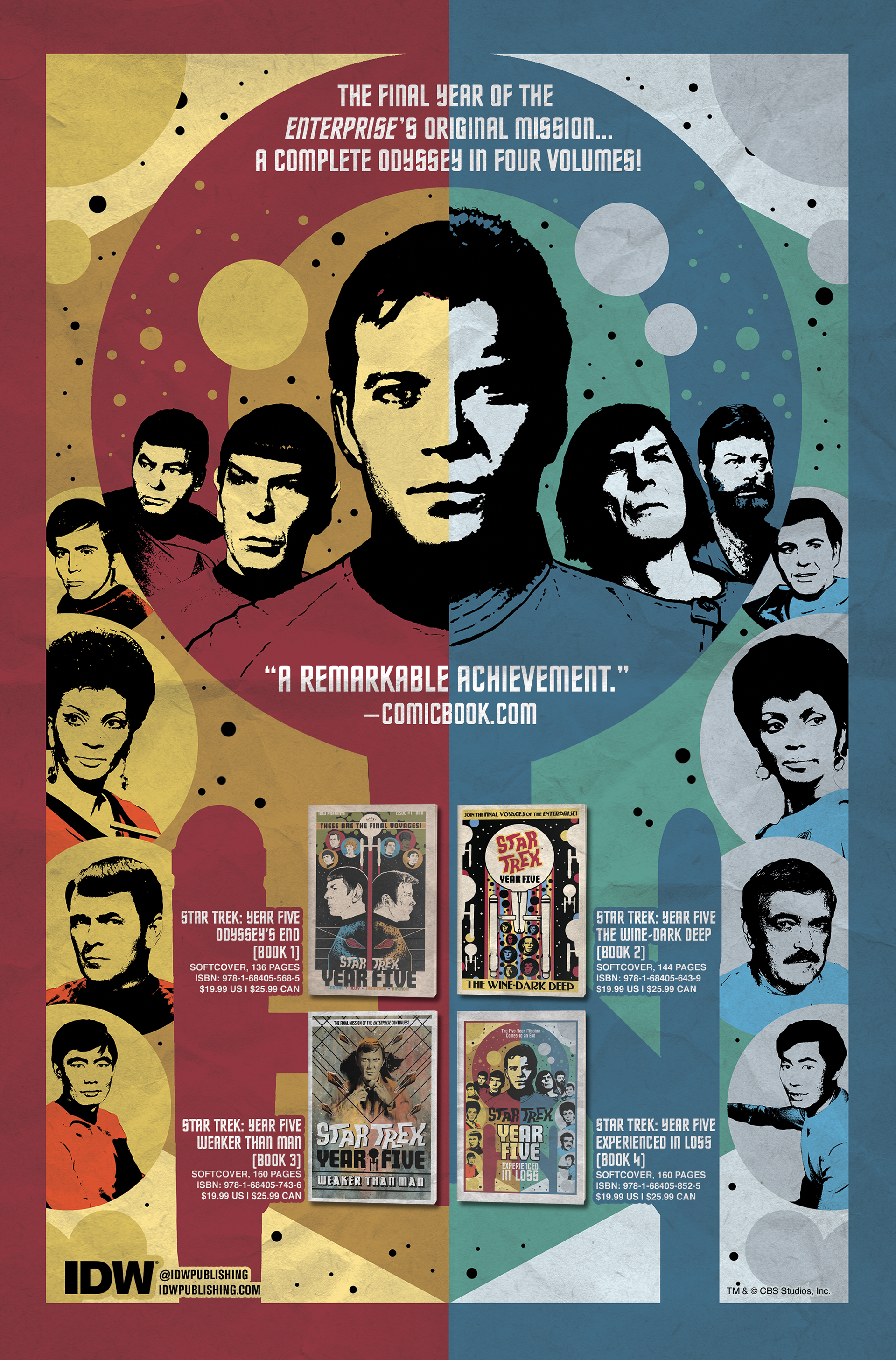
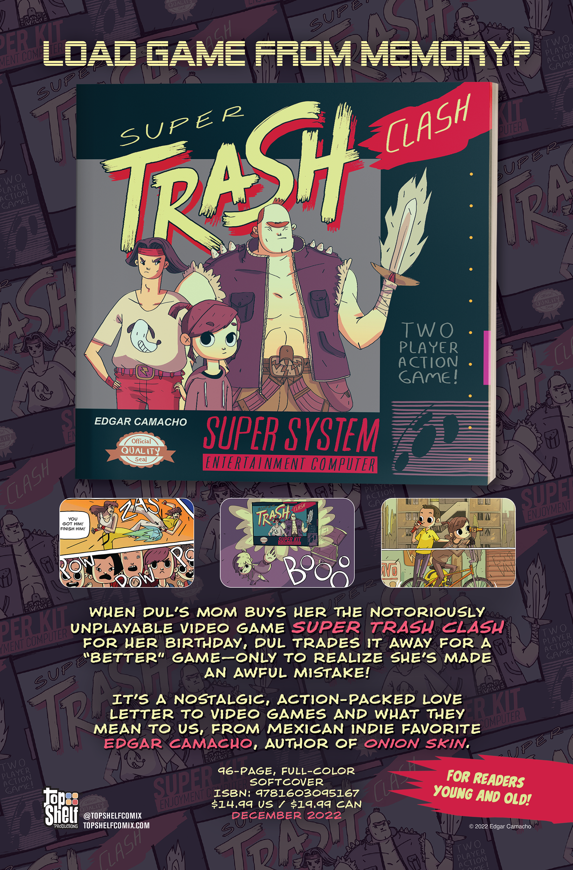
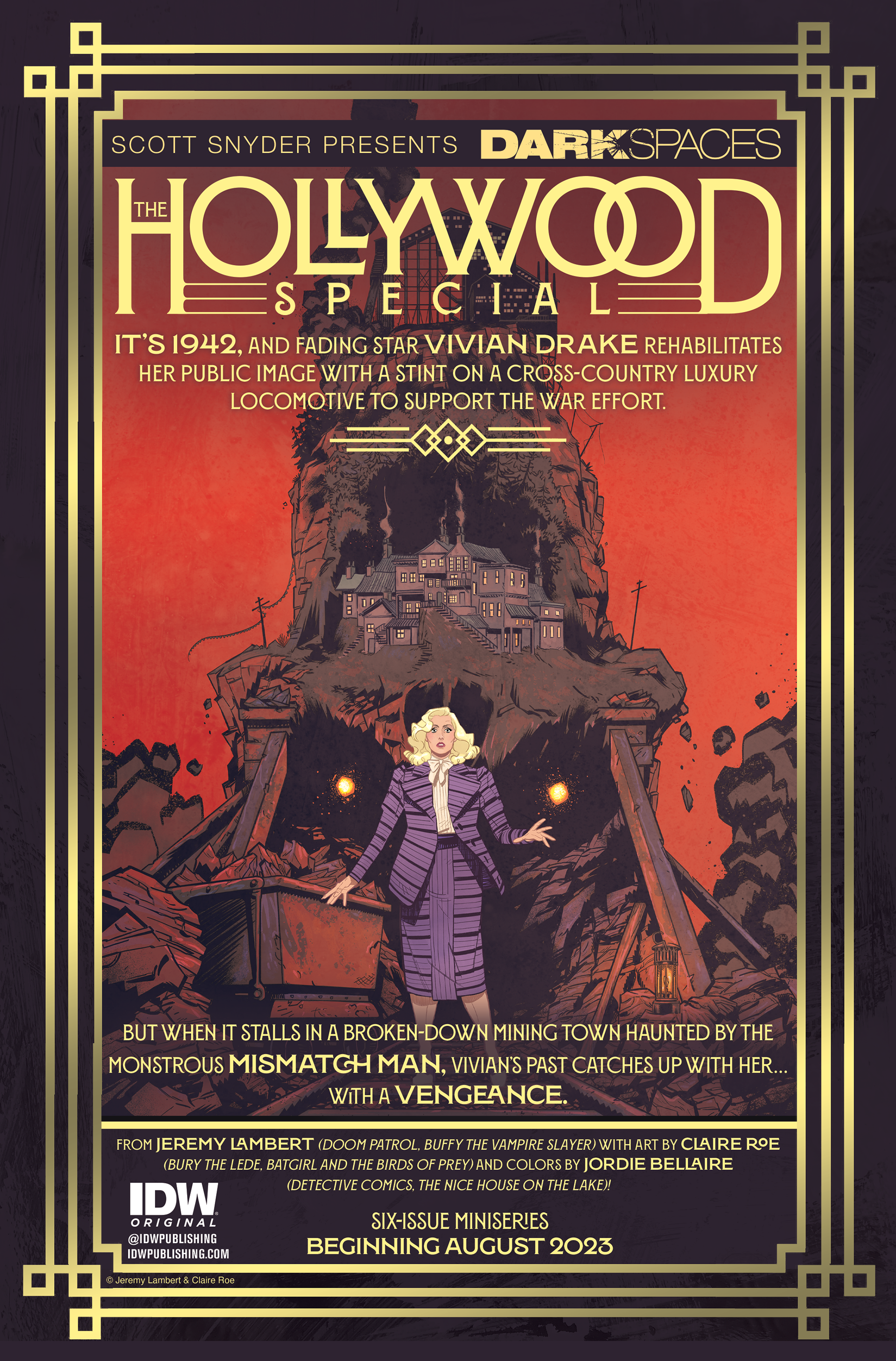
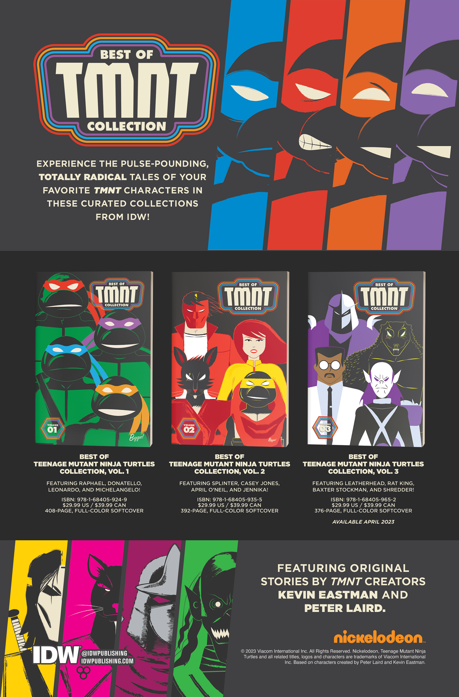
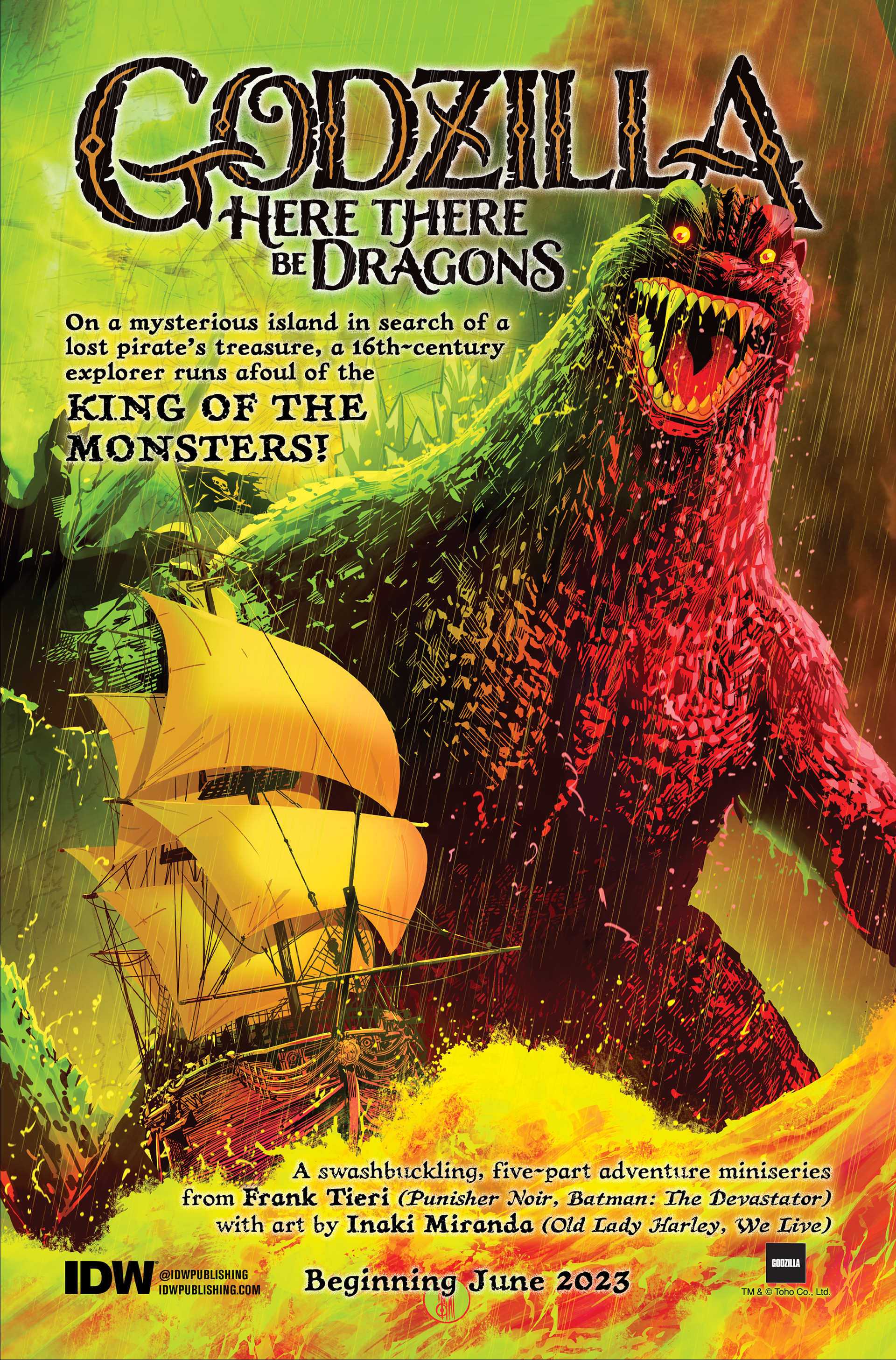
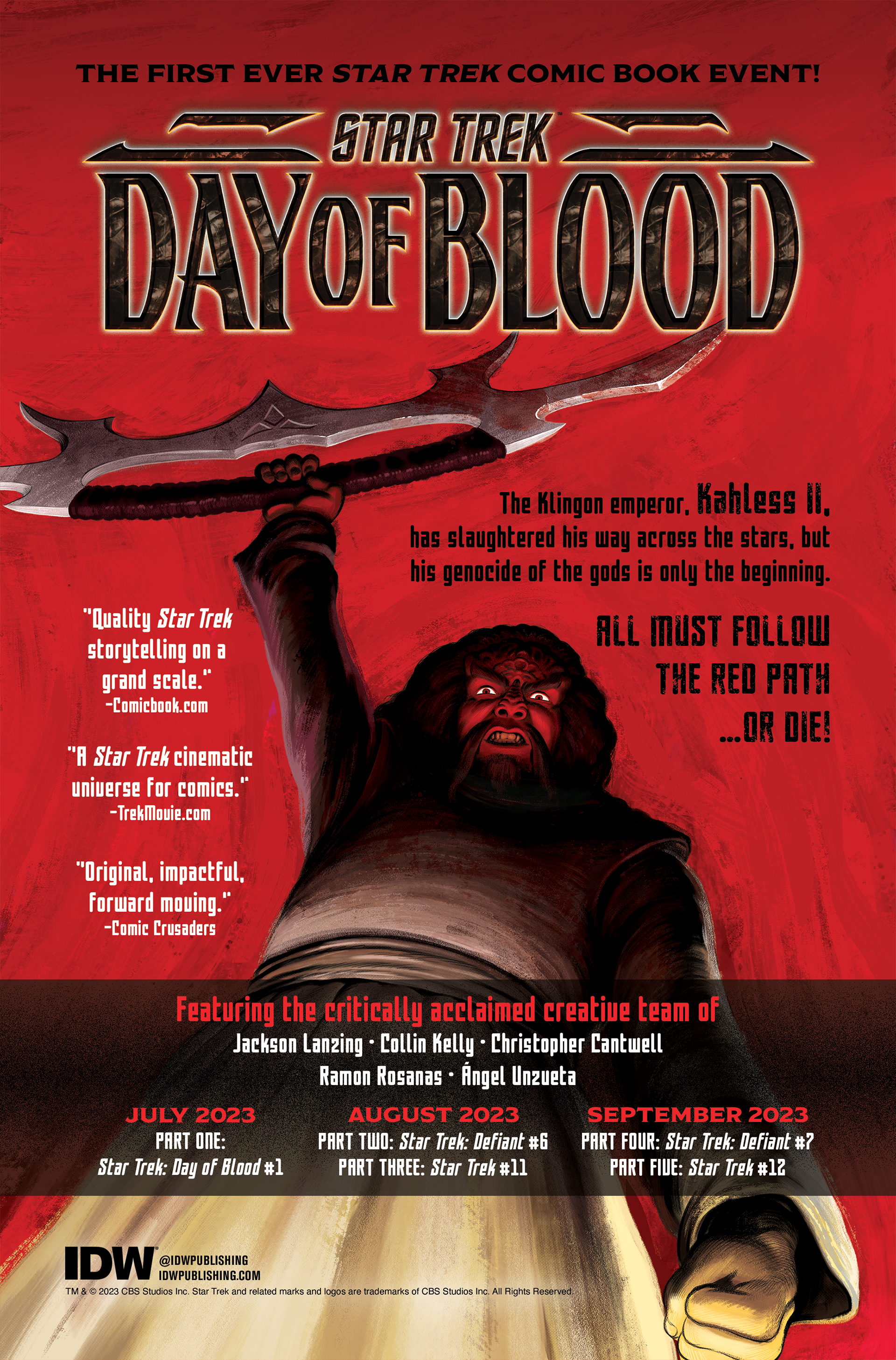
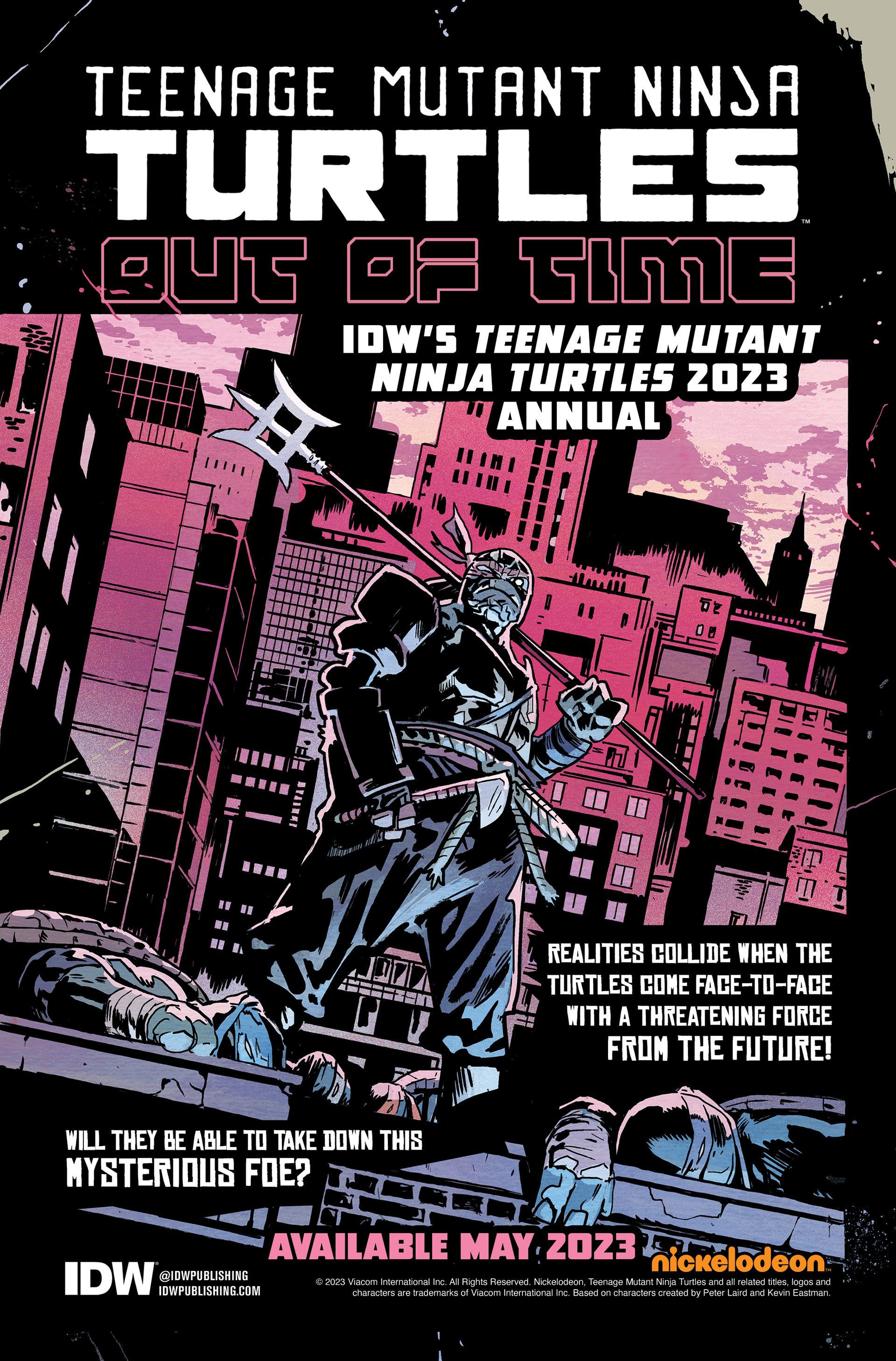
These printed advertisements could be found in all IDW comics, showcasing upcoming one-shot comics, new series, as well as new graphic novels from both IDW and their imprint Top Shelf Productions.
Ads for new series and one-shot comics required the full cover art as the background, while the body copy of the advertisement was added in available space, so as not to obscure the art. Hierarchy was the top priority in these ads, starting with the book's art and logo, leading the eye through the body copy while keeping the book's release date highly visible upon first viewing.
For graphic novels, the process was similar but more creatively demanding. For softcover and hardcover books, a mockup of the book took center stage in the ad, as visual elements had to be created to add interest and showcase the book's visual style. Below is an example of an ad for the first issue of the limited series Dark Spaces: Wildfire, compared to the trade paperback collecting the entire series.


The visual elements for these ads included finding appropriate background images and stills from the book's art, as well as creating additional visual elements that matched the book’s style. Below is an example of an ad for the book Arca, in which I duplicated the cover's primary visual element and used it to showcase the book's art and story.
Backlist ads were even more intensive, as they required an understanding of the visual style of an entire series.


Occasionally, back ads expanded to two-page spreads.
Below are more examples of back ads I created.

